
$0.00
Letterhead Design: How to Make a Professional First Impression
- August 20, 2026
- Industry Solutions, Local Businesses, Printing Tips
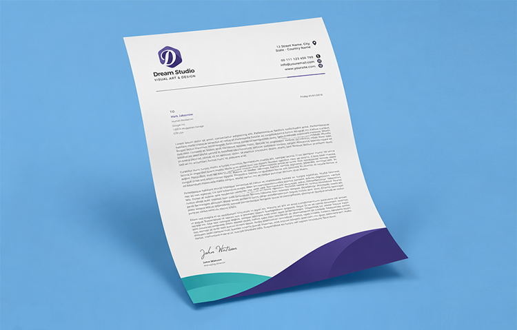
A letterhead rarely gets the design attention it deserves. Businesses will spend weeks perfecting a logo and a website, then slap that same logo onto a blank page and call it a letterhead. But for formal correspondence, contracts, and official documents, a letterhead is often the first physical thing a client actually holds, and a rushed one can undercut months of brand building in a single glance. Here is how to get it right.
Why Letterhead Design Still Matters
Email has replaced most day to day correspondence, but letterheads have not disappeared. Contracts, formal proposals, compliance documents, and official letters still commonly go out on branded letterhead, particularly in industries like law, finance, real estate, and healthcare where a document needs to feel official. A well designed letterhead signals that a business pays attention to detail, which matters most in exactly the moments when a client is deciding whether to trust you.

Keep the Layout Clean
The biggest mistake in letterhead design is overcrowding the page. A letterhead needs to support the content of the letter, not compete with it. Logo, business name, and contact details are usually enough. Resist the temptation to add taglines, social media icons, or decorative graphics that eat into the space needed for the actual letter.
A simple, reliable structure works well for most businesses:
- Logo and business name positioned at the top, either centred or aligned left
- Contact details (phone, email, address, website) in the header or footer, kept small and unobtrusive
- Generous white space left for the body of the letter
- Optional light branding element, such as a coloured line or subtle graphic, along one edge
Where to Place Your Logo
Left aligned logos read as more traditional and formal, which suits industries like legal or financial services. Centred logos feel slightly more contemporary and balanced. Right aligned placement is less common but can work well if your brand wants to stand out from convention. Whichever position you choose, keep it consistent across every piece of stationery, business cards, envelopes, and compliment slips included, so your brand reads as coordinated rather than assembled from mismatched pieces.
Choosing the Right Paper Stock
Letterhead is one of the few print products where paper stock genuinely affects perception. Standard A4 letterhead is typically printed on either 80gsm or 100gsm laser stock. The 80gsm option is a solid, professional everyday weight, while stepping up to 100gsm gives the sheet noticeably more substance in the hand, which some businesses prefer for formal contracts or client facing correspondence. Both are uncoated, which is exactly the right finish for letterhead, since an uncoated surface takes pen ink and signatures cleanly without the smudging or glare a glossy finish would introduce.
Choosing an uncoated recycled stock instead of standard uncoated is also worth considering if sustainability is part of your brand story. It prints and handles identically to standard uncoated laser stock, so there is no compromise on the finished look.

Colour and Branding Consistency
Your letterhead should use the same colours, fonts, and logo files as the rest of your brand, no exceptions. Nothing undercuts brand credibility faster than a letterhead that looks like it belongs to a different company than the website or business card a client already has. If your brand guidelines specify exact colour codes, make sure your printer receives the correct CMYK values, since colours can shift noticeably between what appears on a screen and what prints on paper.
Single Sided or Double Sided?
Most letterhead is printed single sided, with the reverse left blank for handwritten notes or simply because one page rarely fills up. Double sided printing is worth considering if your letters commonly run onto a second page, or if you want standard terms, ABN details, or a registered office address printed on the reverse so it does not need to be typed out every time. It is a small decision, but worth confirming upfront since it affects layout on both sides of the sheet, not just the front.
If you need help designing or printing letterhead that actually reflects your brand, browse our letterhead printing to get started.